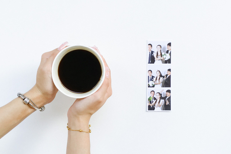
As much as we live in a digital world, nothing beats the excitement of getting a physical photo print—that’s one of the biggest attractions of having a photo booth.
There’s something special about holding a photo booth print in your hands, rather than viewing it on your screen. It makes the photo more significant; not just one of the thousands on your phone. You can keep it in your wallet, stick it on your fridge or frame it on your work desk.
That means that when you rent a photo booth, the print is an important part of the experience. You want to make sure that it’s beautifully and thoughtfully designed, just like every other aspect of your photo booth.
A good photo booth print out design will mark the significance of your event, whether it’s a company dinner, birthday party or wedding. It will complement your backdrop and props. If you’re planning a corporate event, it’s an important element of your branding—keeping your brand in the mind of your customers.
Your Event, Our Care
When you work with a professional photo booth company (like us), you will usually get a custom border design as part of your package. This should be designed from scratch, rather than using a standard template.
In this article, we give you tips on how to create the perfect photo booth print design for your event.
This is a useful reference, whether you’re doing the design yourself or communicating your expectations with your designer.
Tip #1: Choose Your Print
The type of print you get is tied to the type of photo booth that you hire. Hence, start your discussion with the kind of experience you want to offer.
Do you want to play it safe with a traditional experience, because you’re planning a formal dinner? Or do you want to create a fun and engaging experience because you’re targeting a younger crowd?
With a classic photo booth, you’ll usually get a 4R print. Smaller options, like credit card sized prints, are available too.
With a GIF booth, you’ll be taking multiple photos, which can be arranged in a 4R print or photo strip print.
With a boomerang booth, you can get Ubersnap’s unique holographic prints.
Tip #2: Make Your Design Pop

Generally, you want your photo border to be visually separate from your photo, so that it can be seen clearly. A layout design that blends into a photo will be hard to distinguish, and can make the final result look like a visual mess.
There are a couple of ways to achieve this.
The simplest way is to create a solid border that frames your photos. It doesn’t have to be a basic square border—we’ve created many complex-looking print designs with curves and shapes.
A solid border also provides a background for your logo and text to stand out.
If you’re doing without a solid border, use lighter colours for your logo and text. Add drop shadows to make them pop.
Tip #3: Keep It Simple
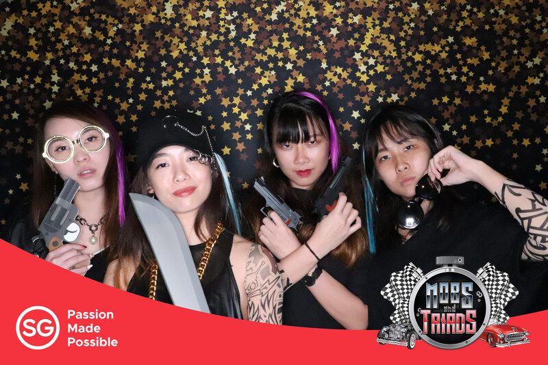
One of the common mistakes is trying to do too much with your print out design. Remember that your layout should complement your photo, rather than vie for attention with it.
A simple white border may look plain on its own, but it can be the perfect frame for a busy photo. The best way to test this is to place your design on top of a sample photo.
Start with your must-haves—the most important elements of your design. For corporate events, it’s usually the logo and event name. For weddings, it’s the couple’s names and date of their wedding.
Be critical of any additional element. Is it really necessary to have it?
The same applies to the colour palette. It’s tempting to make your photo border extremely colourful, so that it pops. However, we’ve found that a restrained approach often works best.
Limit your design to just 1 or 2 main colours, with shades in between.
With an analogous colour scheme, you’re using colours that are close to one another on the colour wheel—creating a pleasant and relaxing design.
With a complementary colour scheme, you’re using colours from opposite sides of the colour wheel. It creates strong contrasts, which can be useful in highlighting certain aspects of your design.
In the words of a famous designer, less is often more, especially for a photo booth print layout.
Tip #4: Match Your Theme
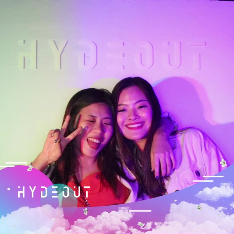
If you have a theme for your event, you want every element to fit with the theme—and that includes the prints that you get from your photo booth.
Bring visual elements from your overall theme into your photo booth border design. That includes the colour scheme, patterns, fonts, and even mascots.
Make sure that you communicate your expectations clearly with your photo booth company. The most effective way is to send reference materials, such as posters, social media posts and invitation cards.
Tip #5: Complement Your Backdrop
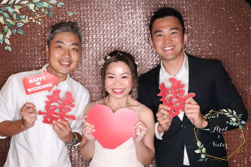
Remember, your photo booth print out design will not stand on its own—it’ll be combined with your photos.
The last thing you want is to spend days working on it, only to realise that it clashes horribly with your backdrop.
We advise that you first decide on your backdrop, whether it’s choosing from our standard collection or making your own custom backdrop. Only after that’s done, do you start working on your print design.
Nothing is more frustrating than having to revise your print layout design because you changed your mind on your backdrop.
Generally, we advise choosing colours that stand out from your backdrop. For example, a white border will blend in with a white backdrop, but a red border will stand out.
We’ve Got This
Conclusion
Beautiful prints will take your photo booth experience to the next level. They will be treasured for years as physical reminders of your event.
Coming up with a print out design takes knowledge and experience. Fortunately, we have a wonderful team of designers who have worked on over 1,000 events. That’s a lot!
What is the best photo booth print layout design that you have seen?

